
As opposed to realism, which is characterized by framing “everyday life” in a naturalistic manner, a style known as formalism allows for the natural flow of the story to take a backseat in favor of color, background and framing.
Not only does this style allow for an aesthetically pleasing viewing experience filled with bright colors and entertaining sequences, it also helps build a meticulously crafted and nuanced atmosphere that builds a lively world that appears as if the characters actually live within the frames.
Wes Anderson is an American filmmaker known for his unique formalistic camera and narrative style.
Formalism is consistent in each and every one of Anderson’s movies, the most popular being the 2012 camp drama-romance “Moonrise Kingdom,” the 2014 “heist” drama-comedy “Grand Budapest Hotel” and the 2009 stop-motion animated comedy-drama “Fantastic Mr. Fox.”
Early filmography
In the beginning of his ten-film spree over the past thirty years, Anderson cast his college roommate Owen Wilson, and subsequently his brother Luke Wilson, in his short film titled “Bottle Rocket” in 1994.
The short film was developed into a feature-length film in 1996. Although not a straight commercial success, the film received critical acclaim, achieving an 85% on Rotten Tomatoes and even praise from filmmaker Martin Scorsese, who called the film “a rarity,” according to Esquire.
This acclaim allowed Anderson to develop more ambitious films with more than just a shoestring budget. The style of the short film and the film did not have the immediately noticeable cartoonish style of formalism as Anderson would become known for, but the cinematography and narrative is nonetheless Anderson-esque.
In terms of Anderson’s future style, the film and the next few subsequent films seem half-baked and under-realized compared to the quirkiness of his modern movies.
Anderson’s next film, “Rushmore,” was released in 1998 with a substantial increase in budget from the previous film, from $5 million to $10 million. This was Anderson’s first to feature Bill Murray, one of the many recurring actors in his future films. The film was also one to improve on Anderson’s style, using a somewhat more centered framing and more vibrant colors, as well as creating an interesting comedic narrative.
While “Bottle Rocket” had only seen little commercial success, “Rushmore” saw $17 to $19 million dollars, almost doubling the cost of the budget. Furthermore, the film received even more critical success than its predecessor, receiving a 90% on Rotten Tomatoes and a 7.6/10 on IMDB.

“The Royal Tenenbaums,” “The Life Aquatic with Steve Zissou,” and “The Darjeeling Limited”
Anderson would continue to build his arsenal of critical successes, following “Rushmore” with “The Royal Tenenbaums” in 2001, “The Life Aquatic with Steve Zissou” in 2004 and “The Darjeeling Limited” in 2007. Each of the films would build in style and symbolism, as well as improve in story structure.
“The Royal Tenenbaums” is a film about family – the separation, the lives after and the inevitable reunion of blood.
The color scheme of deep, rich browns, yellows and reds allow for comfort and warmth in the midst of a depressing tale of separation. While those colors are mainly a part of Royal Tenenbaum and his wife, the two who are separating, his three children are introduced with a cool yet bright palette of blues and whites.
This separation of colors creates a contrast to demonstrate the literal separation from their parents; however, the three children are also shown wearing the iconic bright red tracksuits throughout the film that influence the fact that a part of their parents are always a part of them, while also demonstrating that the three will always stand out, as they are extraordinarily gifted.
The film was also the first of Anderson’s to receive an Academy Award nomination for best original screenplay.
. . .
“The Life Aquatic with Steve Zissou” demonstrates a color palette of deep and light blues to express the vastness of the ocean and the world under the water. The blues also contrast with the character’s uniforms and equipment consisting of bright orange knitted beanies and bright yellow submarines that are aesthetically pleasing and stand out from the sea.
However, the colors also demonstrate a sort of harmony between the ocean and the land-dwellers, as the film deals with sadness, regret and hope – the blues demonstrating a “sea” of sadness and the warmer colors a glimpse of hope for the future.
. . .
“The Darjeeling Limited” builds on the symmetrical framing and unique storylines that Anderson would come to be known for.
Matte and mellow tones of blue, green, yellow and red are used to highlight the colors of India, where the film mostly takes place. The three siblings that lead the story are brought into an unfamiliar place, where the primary colors create a comforting atmosphere that push the characters forward.
The train that takes the trio across India in search of their mother, known as the historical Darjeeling Himalayan Railway that is still in use today symbolizes the path of grief from their father’s passing.
It is in this particular film that Anderson’s formalism begins to peek its head out, demonstrating a deeper understanding of symmetry and the usage of slow-motion and stop-motion.

A switch to stop-motion
Wes Anderson is not a stranger to stop motion.
Anderson has created such movies as “Fantastic Mr. Fox” and “Isle of Dogs,” while also dabbling in stop-motion before creating fully animated films with an animated sequence in “The Darjeeling Limited.”
Though Wes Anderson improved on color, framing and narrative within his first few films, a noticeable shift occurred in 2009 with the release of Anderson’s first fully stop-motion animated comedy-drama, “Fantastic Mr. Fox.” Once again, Anderson uses a warm aura of deep reds, browns and oranges in order to comfort the audience through a depressing story of exile and greed.
However, it is in the framing and narrative in which Anderson’s style shifted.
Using stop-motion allowed Anderson to fully realize the story exactly how he imagined it, including the framing, the backgrounds, the motions of the characters and a unique narrative structure that normally can’t be realized in live-action framing. The story demonstrates a clear usage and understanding of symmetry; every frame in the film was able to be crafted in order to be appealing to the eye, but also to symbolize the false sense of order and safety that Mr. Fox reassures his assailants and family with.
The film was nominated for an Academy Award for best-animated feature.

“Moonrise Kingdom”
It was with the usage of symmetrical framing and a quirky, animated-esque storyline that Anderson implemented into his future films, beginning with “Moonrise Kingdom” in 2012. The movie takes place in the summer of 1965, where young boy scout Sam falls in love with a girl named Suzy and the two run away.
According to Hitfix, “I just wanted to make a story that was my fantasy of that age,” Anderson said.
The palette consists mainly of yellow, green and blue– the colors found mainly in the forest and nature, but also ones that are nostalgic with Anderson’s younger age filled with fantasies of adventure and love.
However, it is within the outlier of Suzy’s pink dress where the symbolism shows; the pink in Suzy’s dress expresses the romantic desire of Sam, while also showing the innocent adolescence of Suzy.
The colors soon turn dull as a storm approaches and the story progresses, showing how impulsive decisions can quickly turn awry and consequences can reveal themselves. The color blue deepens further as the storm engulfs the island, eventually becoming extremely dark, where the story is told through shadows. This demonstrates the ignorant and innocent mind of a child thrown into the darkness of adolescence and growing up, a stretch of time that is indefinite and confusing.
Eventually emerging from the storm, the colors return as lessons are learned and families reunite.
The movie takes heavy inspiration from Anderson’s previous film, “Fantastic Mr. Fox,” which shifted Anderson’s style of realism in favor of building on a cartoonish set with symmetrical framing on the camera.
It is with this symmetrical framing and cartoonish set that Anderson can create a child-like aura that enhances the nostalgia of a childhood filled with fantasies of wandering around the forest and pondering romance.
Once again, Anderson was nominated for an Academy Award for best original screenplay.

“The Grand Budapest Hotel”
Two years later, Anderson would release what is known as his magnum opus – “The Grand Budapest Hotel” in 2014.
This film is possibly the widest range in the usage of color and framing that Anderson has made to date, using an extremely bright red, a soft pink and blue, a deep purple and warmer and deeper tones such as brown. The red and pink provide a sense of elegance, contrasting (or, moreso adding to) the greedy and malicious intentions of the concierge Monsieur Gustave.
Flipping through different timelines to the second one, the hotel is derelict due to lack of people, though the colors of the hotel stay intact as to show the heart of the foundation of the hotel will always be known.
When an older Zero Mustafa meets a young author and explains his past with the hotel and M. Gustave, the timeline switches back to a younger Zero, not before sitting down with the author at a dinner atoned with warm oranges and browns in order to express a calm and inviting atmosphere into the story of the Grand Budapest Hotel.
In the first timeline set in 1932, Zero, a young bellhop newly appointed to the Grand Budapest Hotel, meets the concierge Monsieur Gustave, who seduces old and wealthy clients (inadvertently) to be a part of their will.
The uniforms of the Grand Budapest Hotel staff are a deep and vibrant purple, adding to the bright pinks and reds that are used in this timeline of the film. These colors are mainly used to provide a sense of cheerful security in a time of war and poverty, as the timeline takes place in the midst of the second world war.
The story of Zero takes off, including a heist for a painting laid out in the will of one old and wealthy client who mysteriously died about a month after her visit at the hotel, a bounty hunter, and a prison escape.
What is particularly interesting about the framing of this film is not only the sweeping shots of symmetry that pushes the camera around– zooming in and out and around, but it is also the changing of aspect ratios as the different timelines are introduced. This is observed when the first timeline of 1932 ends and the camera switches back to the second timeline in 1968 where the author and Zero finish their conversations.
The ratio of 4:3 in the first sequence, commonly used to replicate the ratios of older films made at the time, switches to a ratio of 2.35:1 for the second timeline.
The ratio once again changes to a 16:9 ratio when the timeline changes to an older version of the author, who has written a book about the stories Zero had told him about the hotel.
This timeline boasts deep and matte oranges and yellows to give the same comforting tone that Zero had given the author which ultimately led to the author writing a book about the hotel.
Finally, a fourth timeline is revealed with drained colors at the site of the author’s graveyard, showing a young woman eager to learn about the stories, picking up the author’s book and reading it beside his grave.
The film was Anderson’s biggest critical success, becoming nominated for the Academy Award for Best Picture, Best Director, Best Original Screenplay, Best Cinematography and Best Film Editing; the film won Best Original Score, Best Production Design, Best Makeup and Hairstyling, and Best Costume Design.
After checking out of the hotel
After the critical success of “The Grand Budapest Hotel,” Wes Anderson decided to step back and exercise the stop-motion part of his filmography once again with “Isle of Dogs,” which was released in 2018, and then returned back to form following the pandemic and all the issues that came along with “The French Dispatch” in 2021.
Anderson was reportedly inspired by seeing a road sign for the Isle of Dogs in England while “Fantastic Mr. Fox” was in development, according to Episode 70 of The Adam Buxton Podcast.
The story follows a professor in search of finding a cure to an outbreak of canine flu that prompted the exile of all dogs from the fictional Japanese city of Megasaki and a young boy in search of his lost dog.
Though an animated film, Anderson mainly used black, white, brown and deep reds and created a more realistic set in order to express the more mature themes of isolation, political and corporate corruption and racial stereotyping.
Automatically, the idea of isolation is prevalent when exploring the island filled with dogs that the young boy explores in search of his dog. The colors of brown, black, and white are most prevalent in the movie due to the island being dirty and trashed, although sudden glimpses of pink and blue can be seen to add color to the landscape of waste. As for corruption, the use of natural colors depicts a more realistic setting in the midst of a cartoonish aspect (where there are talking dogs expressing their sentiments as castaways).
While the style is rich, many critics report the film as lacking substance, according to New York Times.
. . .
Anderson’s tenth film, “The French Dispatch,” was set to premiere at the Cannes Film Festival on May 12, 2020 and get a wide release on July 24, 2020, but the COVID-19 pandemic hindered that release.
The film then premiered at the 2021 Cannes Film Festival and released in limited theaters on Oct. 22, 2021, followed by the wide expansion of Oct. 29, 2021.
After a year-long pandemic and a delayed release, the expectations for the film fell in high regard. Although the film grossed $46 million against its $25 million budget, the ratings achieved were some of the lowest in his filmography.
The film achieved a 7.1 on IMDB and a 75% on Rotten Tomatoes, becoming the third lowest rated in Anderson’s filmography.
The plot centers around a newspaper known as “The French Dispatch” and brings the stories published in the paper alive.
The majority of the movie is shaded in black and white, while only using color when switching back to the present from the stories. This dichotomy is mainly used to separate certain events from the past and the present in order to ponder the future.
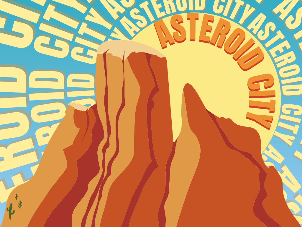
“Asteroid City”
Anderson would quickly put his next film, “Asteroid City,” into production. The film is set for a release on June 16, with a screenplay co-written by Roman Coppola, the son of Francis Ford Coppola, renowned director of “The Godfather” and “Apocalypse Now.”
Multiple trailers have already been released, featuring returning actors Edward Norton, Tony Revolori, Jason Schwartzman and Adrien Brody; the trailers also reveal new actors Tom Hanks, Margot Robbie, Scarlett Johansson, Maya Hawke and Steve Carrell.
From the trailers, the plot is set in 1955 and is about a junior stargazing convention in a place called “Asteroid City.” Schwartzman’s character’s car has broken down in the town as strange alien creatures arrive, causing the place to be quarantined.
The aesthetic is noticeably present in the trailer: a mellow, 1950’s filter overlaps the harsh orange desert along with soft reds and blues, and Steve Carrell boasts a bright green visor against the bright orange desert.
As Anderson’s next film, his trademark formalist style combined with the framing and colors don’t seem to fall short.
. . .
It is a surprise that Anderson, a revolutionary filmmaker in every sense, has never won a personal Academy Award. Wes Anderson is an auteur, a filmmaker with such a distinct approach to narrative and cinematography that the overlook for rewarding his brilliance is absurd. Among the auteurs from the likes of Martin Scorsese, Quentin Tarantino and Stanley Kubrick, it is apparent that Anderson has taken his place among the most highly regarded storytellers, an artist who is relentless in his unique formalist style.